Goodness-of-Fit Testing with SQL Server, part 2.1: Implementing Probability Plots in Reporting Services
By Steve Bolton
…………In the first installment of this series of amateur self-tutorials, I explained how to implement the most basic goodness-of-fit tests in SQL Server. All of those produced simple numeric results that are trivial to calculate, but in terms of interpretability, you really can’t beat the straightforwardness of visual tests like Probability-Probability (P-P) and Quantile-Quantile (Q-Q) Plots. Don’t let the fancy names fool you, because the underlying concepts aren’t that difficult to grasp once the big words are subtracted. It is true that misunderstandings may sometimes arise over the terminology, since both types of visual goodness-of-fit tests are often referred by the generic term of “probability plots” – especially when we use the Q-Q Plot for the Gaussian or “normal” distribution, i.e. the bell curve, which is often called the “normal probability plot.”[1] Nevertheless, the meaning of either one is easy to grasp at a glance, even to an untrained eye: basically, we just build a scatter plot of data points, then compare it to a line that represents the ideal distribution of points for a perfect match. If they look like they follow the same path – usually a straight line – then we can conclude that the distribution we want to assess fits well. Visual analysis of this kind is of course does not provide the kind of detail or rigor that more sophisticated goodness-of-fit tests can, but it serves as an excellent starting point, especially since it is relatively straightforward to implement scatter plots of this kind in Reporting Services.
…………As I found out the hard way, the difficult part with implementing these visual aids is not in representing the data in Reporting Services, but in calculating the deceptively short formulas in T-SQL. For P-P Plots, we need to compare two cumulative distribution functions (CDFs). That may be a mouthful, but one that is not particularly difficult to swallow once we understand how to calculate probability distribution functions. PDFs[2] are easily depicted in histograms, where we can plot the probability of the occurrence of each particular value in a distribution from left to right to derive such familiar shapes as the bell curve. Since probabilities in stochastic theory always start at 0 and sum to 1, we can plot them a different way, by summing them in succession for each associated value until we reach that ceiling. Q-Q Plots are a tad more difficult because they involve comparing the inverse of the CDFs, using what is alternately known as quantile or percent point functions[3], but not terribly so. Apparently the raison d’etre for these operations is to distill distributions like the Gaussian down to the uniform distribution, i.e. a flat line in which all outcomes are equally likely, for easier comparison.[4]
Baptism By Fire: Why the Most Common CDF is Also the Most Trying
Most probability distributions have their own CDF and Inverse CDF, which means it would be time-consuming to implement them all in order to encompass all of the known distributions within a single testing program. The equations involved are not always terribly difficult – except, however, when it comes to the most important distribution of all, the Gaussian. No exact solutions are available (let alone mathematically possible) for our most critical, must-have use case, so we must rely on various approximations developed by mathematicians over the years. One of my key goals in writing self-tutorials of this kind is to acquire the ability to translate equations into T-SQL, Visual Basic and Multidimensional Expression (MDX) quickly, but I got a baptism by fire when trying to decipher one of the symbols used in the error functions the normal distribution’s CDF depends upon. The assistance I received from the folks at CrossValidated (StackOverlow’s machine learning and statistics forum) was also indispensable in helping me wrap my head around the formulas, which are apparently a common stumbling block for beginners like me.[5] For the Inverse CDFs I also had to learn the concept of order statistics, i.e. rankits, which I can probably explain a lot more succinctly than some of the unnecessarily prolix resources I waded through along the way. The mathematical operation is really no more difficult than writing down all of your values in order from lowest to highest, then folding the sheet of paper in half and adding the corresponding points together. The Wikipedia discussion page “Talk:Rankit” helped tremendously; in fact, I ended up using the approximation for the R statistical package that is cited there in my implementation of the Gaussian Inverse CDF.[6]
…………While slogging through the material, it began to dawn on me that it might not be possible to implement even a crude solution in T-SQL, at least for tables of the size SQL Server users encounter daily. Indeed, if it weren’t for a couple of workarounds like the aforementioned one for R I found scattered across the Internet, I wouldn’t have finished this article at all. Resorting to the use of lookup tables for known values really doesn’t help us in the SQL Server world, because they simply don’t go high enough. I was reunited with one of the same stumbling blocks I often encountered when writing my last mistutorial series, namely that fact that the available lookup tables for known rankit values simply don’t go anywhere near high enough for the size of the tables used in SQL Server databases and cubes. For example, one compendium of statistical tables I consulted could only accommodate up to 50 values.[7]
In the Absence of Lookup Tables, Plan on Writing Intricate SQL
This is merely a subset of the much broader issue of scaling statistical tests that were designed generations ago for much smaller sample sizes, of a few dozen or a few hundred records, to the thousands or millions of rows routinely seen in modern databases. In this case, I was forced to calculate the missing rankit values myself, which opened up a whole new can of worms. Another critical problem with implementing the CDF and Inverse CDF in code is that many of the approximations involve factorials, but those can only be calculated up to values around 170 without reaching the limit of the T-SQL float data type; this is actually quite good compared to other languages and statistical packages, which can often handle values only up to around 20.[8] Thankfully, Peter John Acklam published a decent approximation algorithm online, which can calculate Inverse CDFs for the normal distribution without factorials. It’s only good to a precision of 1.15 x 10⁻⁹, which may not be sufficient for some Big Analysis use cases, but this code ought to be enough to get a novice data miner started.[9]
…………The complexity of implemented probability plots is further increased when we factor in the need to write separate code for each distribution; most of them aren’t as difficult as the Gaussian, which has no closed-form solution, but providing code for each of them would require dozens of more articles. For that reason, I’ll stick to the bell curve for now; consequently, I also won’t get into a discussion of the lesser-known Probability Plot Correlation Coefficient Plot (PPCC), which is only applicable to distributions like the Weibull that have shape parameters, unlike the bell curve.[10] Another complication we have to deal with when using CDFs, inverse CDFs and PDFs is that different versions may be required for each, depending on whether you want to return a single value or a whole range, or whether such inputs as the mean, standard deviation and counts are already known or have to be computed on the fly. Later in this series we will probably have to make use of some of these alternate versions for more advanced fitness tests, so I’ve uploaded all 14 versions I’ve coded to date in one fell swoop to one central repository on DropBox, which are listed below:
NormalDistributionCDFSP.sql
NormalDistributionCDFSupplyMeanAndStDevSP.sql
NormalDistributionCDFSupplyMeanStDevAndRangeSP.sql
NormalDistributionCDFSupplyTableParameterSP.sql
NormalDistributionInverseCDFFunction.sql
NormalDistributionPDFAndCDFSupplyMeanStDevAndRangeSP.sql
NormalDistributionPDFSP.sql
NormalDistributionPDFSupplyMeanAndStDevSP.sql
NormalDistributionPDFSupplyMeanStDevAndRangeSP.sql
NormalDistributionRankitApproximationSP.sql
NormalDistributionSingleCDFFunction.sql
RankitApproximationFunction.sql
RankitApproximationSP.sql
RankitApproximationSupplyCountSP.sql
SimpleFloatValueTableParameter.sql
…………Keep in mind that, as usual, I’ve only done very basic testing on these stored procedures and functions, so they’ll probably require some troubleshooting before putting them into a production environment; consider them an example of how a professional solution might be engineered, not as a finished product. I did some validation of the procedures against various CDF and Inverse CDF lookup tables and calculators I found on the Web, but only for a handful of values.[11] The .sql file names are pretty much self-explanatory: for example, NormalDistributionPDFSupplyMeanAndStDevSP returns the PDF function for the normal distribution if you supply the mean and standard deviation, whereas the NormalDistributionSingleCDFFunction does just what it says by returning one value out of a set of CDF results. A few take table variables as inputs, so I’ve included the SimpleFloatValueTableParameter I defined to supply them. I’ve followed my usual coding style by appending SP and Function to the ends of the names to denote what type of object they are. The NormalDistributionRankitApproximationSP, RankitApproximationSP and RankitApproximationSupplyCountSP procedures use the aforementioned approximation from R, while my implementation of Acklam’s approximation can be found in the NormalDistributionInverseCDFFunction.sql file. Some of the objects are dependent on the others, like the RankitApproximationFunction, which utilizes the NormalDistributionInverseCDFFunction.
…………Some of the other procedures will be of use later in this tutorial series, but in this week’s installment, we’ll be feeding the output from DataMiningProjects.Distributions.NormalDistributionSingleCDFFunction listed above into a couple of SSRS line charts. As I pointed out in three previous articles from the tail end of my last tutorial series, there are plenty of better explanations of how to write reports and do other basic tasks in RS, so I won’t clutter this post with those extraneous details. Basically, the sample procedure below derives the CDF values for the horizontal axis and another set of values for the vertical axis called the Empirical Distribution Function (EDF), which is just a fancy way of saying the values actually found in the dataset. Anyone familiar with the style of sample code I’ve posted on this blog can tell that we’re just using dynamic SQL to calculate distinct counts, with the difficult computations hidden inside the CDF function; I reuse most of the same parameters, intermediate variable declarations and other code seen in past articles, like the SELECT @SQLString for debugging the procedure.
Figure 1: Sample T-SQL to Build a Probability-Probability Plot
CREATE PROCEDURE [GoodnessOfFit].[PPPlot]
@Database1 as nvarchar(128) = NULL, @Schema1 as nvarchar(128), @Table1 as nvarchar(128),@Column1 AS nvarchar(128)
AS
DECLARE @SchemaAndTable1 nvarchar(400),@SQLString nvarchar(max)
SET @SchemaAndTable1 = @Database1 + ‘.’ + @Schema1 + ‘.’ + @Table1
SET @SQLString = ‘DECLARE @Mean as float,
@StDev as float,
@Count bigint
SELECT @Count=Count(CAST(‘ + @Column1 + ‘ as float)), @Mean = Avg(CAST(‘ + @Column1 + ‘ as float)), @StDev = StDev(CAST(‘ + @Column1 + ‘ as float))
FROM ‘ + @SchemaAndTable1 + ‘
WHERE ‘ + @Column1 + ‘ IS NOT NULL
DECLARE @EDFTable table
(ID bigint IDENTITY (1,1),
Value float,
ValueCount bigint,
EDFValue float,
CDFValue decimal(38,37),
EDFCDFDifference decimal(38,37))
INSERT INTO @EDFTable
(Value, ValueCount, EDFValue)
SELECT Value, ValueCount, CAST(SUM(ValueCount) OVER (ORDER
BY Value ASC) as float) / @Count AS EDFValue
FROM (SELECT DISTINCT ‘ + @Column1 + ‘ AS Value, Count(‘ + @Column1 + ‘) OVER (PARTITION BY ‘
+ @Column1 + ‘ ORDER BY ‘ + @Column1 + ‘) AS ValueCount
FROM ‘ + @SchemaAndTable1 + ‘
WHERE ‘ + @Column1 + ‘ IS NOT NULL) AS T1
UPDATE T1
SET CDFValue = T3.CDFValue, EDFCDFDifference = EDFValue – T3.CDFValue
FROM @EDFTable AS T1
INNER JOIN (SELECT DistinctValue, DataMiningProjects.Distributions.NormalDistributionSingleCDFFunction
(DistinctValue, @Mean, @StDev) AS CDFValue
FROM (SELECT
DISTINCT Value AS DistinctValue
FROM @EDFTable) AS T2) AS T3
ON T1.Value = T3.DistinctValue
SELECT ID, ROW_NUMBER() OVER (ORDER BY ID) AS RN, Value, ValueCount, EDFValue, CDFValue, EDFCDFDifference
FROM @EDFTable‘
–SELECT @SQLString — uncomment this to debug dynamic SQL errors
DECLARE @ResultTable table
(PrimaryKey sql_variant,
RN bigint,
Value float,
ValueCount bigint,
EDF float,
CDF float,
EDFCDFDifference float
)
INSERT INTO @ResultTable
EXEC (@SQLString)
SELECT PrimaryKey, RN, Value, ValueCount, EDF, CDF, EDFCDFDifference
FROM @ResultTable
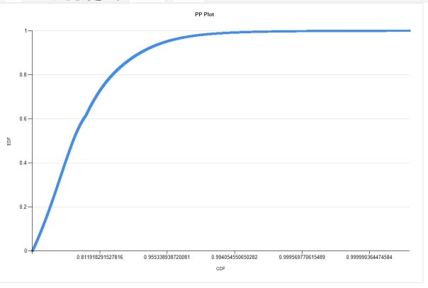
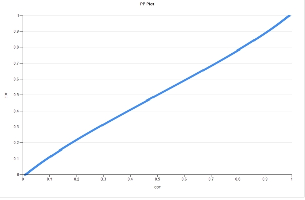
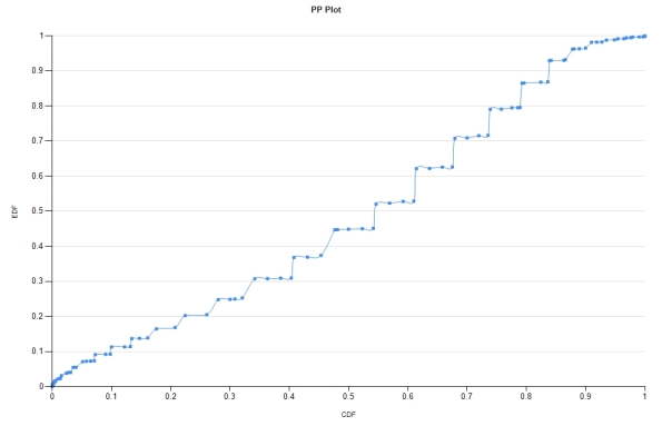
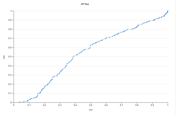
…………If the distribution being tested by the CDF is a good match then the coordinates ought to come as close to an imaginary center line cutting across from (0,0) to (1,1), which are the boundaries of any EDF or CDF calculation. That’s obviously not the case in the first plot in Figure 2, where the coordinates are shifted far to the left and top despite the fact that the horizontal axis is skewed, with most of the values lopped off. The other three all have standard 0.1 intervals, including the second plot, which seems to be a good match. This is not surprising, given that I’ve already performed much more sophisticated goodness-of-fit tests on this data, which represents the second float column in the Higgs Boson Dataset I downloaded from University of California at Irvine’s Machine Learning Repository ages ago for practice data on this blog. The abnormal plot above it comes from the first float column in the same dataset, which I routinely fails tests for the Gaussian/normal distributon. Note how thick the lines are in both: this is because there are 11 million rows in the practice dataset, with 5,001 distinct values for the second column alone. Most of the tests I’ll survey in this series perform well in the databae engine, but trying to depict that many values in an SSRS report can obviously lead to congestion in the user interface. The first plot was particularly slow in loading on my development machine. The third plot loaded quickly because it came from the Duchennes muscular dystrophy dataset[12] I’ve also been using for demonstration purposes, which has a mere 209 rows. The Lactate Dehyrogenase enzyme data embodied in the column I plugged into my procedure is probably not normally distributed, given how erratic it is at the tails and bowed at the center. The fourth plot comes from a time dataset that may be Gaussian despite its jagged appearance, which is caused by the discrete 15-minute intervals it tracks. It is in situations like this where knowing your data is an immense help in successful interpretation, i.e. the end goal of any data mining endeavor. In many other contexts, serrated shapes are often an indicator of abnormality; in this instance, it is dictated by the fixed width of data type intervals chosen.
Figure 2: Four Sample Probability-Probability Plots Derived from T-SQL

…………It should be fairly obvious just from glancing at the results that P-P can serve as outlier detection methods in and of themselves; as the National Institute for Standards and Technology’s Engineering Statistics Handbook (one of my favorite online statistical references) points out, “In addition to checking the normality assumption, the lower and upper tails of the normal probability plot can be a useful graphical technique for identifying potential outliers. In particular, the plot can help determine whether we need to check for a single outlier or whether we need to check for multiple outliers.”[13] Nevertheless, I omitted them from my last tutorial series because they’re simply too crude to be effective in this capacity. If we were going to spot aberrant data points by eye in this manner, we might be better off comparing histograms like the ones I introduced in Outlier Detection with SQL Server Part 6.1: Visual Outlier Detection with Reporting Services with the PDFs of the distributions we want to compare. Even then, we still run into the same chicken-and-egg problem that we encountered through the series on outliers: without goodness-of-fit testing, we can’t determine what the underlying distribution should be and therefore can’t tell if any records are outliers. If we force these fitness tests to do double-duty, we end up sitting between two stools, as the old German proverb says, because then we can’t be sure of either the distribution or the aberrance of underlying data points. Moreover, like most other outlier methods, it doesn’t provide any information whatsoever on why a record is aberrant. Furthermore, some of the approximations the underlying functions use also intrinsically discount outliers, as Acklam’s does.[14] In the case of P-P Plots and Q-Q Plots, we’re more often than not better off using them in their original capacity as fitness tests. No harm is done if we spot an aberrant data point in the scatter plots and flag them for further investigation, but scaling up this approach to full-fledged automatic outlier detection would become problematic once we get into the thousands or millions of data points.
…………This size issue also places a built-in limitation on the usefulness of these visual methods for fitness testing purposes. If all of the data points from a single table are crammed into one thick black line that obscures all of the underlying detail, then we can still draw a reasonable conclusion that it fits the distribution we’re comparing it against. That approach is no longer tenable once we’re talking about one thousand out of a million records being off that line, which forces us to make a thousand judgment calls. Once we try to scale up these visual methods, we run into many of the same problems we encountered with the visual outlier detection methods surveyed in the last series, such as the use of binning and banding – not to mention the annoying restriction in Reporting Services against consuming more than a single resultset from each stored procedure, which forces us to discard any summary data that really ought to be calculated in T-SQL, MDX or DAX rather than in RS. These methods also have some specific inherent limitations, such as the inapplicability of P-P plots when the two distributions don’t have roughly simple center points (as measured by means, medians, modes, etc.).[15] At a much broader level, these tests don’t provide much information on how well a dataset fits a particular distribution, because that would involve half-conscious visual assessments of how much each outlier counts for or against the final verdict. For example, how are we to weigh seven outliers that are two quantiles off the mark, compared to three that are a half a quantile away? These tests are conveniences that allow users to make spot assessments of the fitness of distributions at a glance, with the minimum of interpretation and computational costs, but they simply don’t have much muscle. That is the unavoidable drawback of simplistic tests of this type. They amount to brute force, unconscious assessments that “if nothing looks out of place, the fitness of the distribution is not an issue we need to be worried about” – i.e. the flip side of visual outlier detection methods, which boil down to “if it looks out of place, we’ll look at it more closely.” Once the need arises for more definite confirmation of a dataset’s fit to a particular distribution, we have to resort to tests of greater sophistication, which invariably churn out numeric results rather than eye candy. If I don’t take a quick detour into Q-Q Plots next time around, then in the next installment we’ll climb another rung up this ladder of sophistication as we discuss skewness and kurtosis, which can provide greater detail about how closely a dataset fits its target distribution.
[1] See the Wikipedia articles “P-P Plot” and “Normal Probability Plot” respectively at http://en.wikipedia.org/wiki/P%E2%80%93P_plot and http://en.wikipedia.org/wiki/Normal_probability_plot for mention of these conundrums.
[2] As pointed out in the last article, for the sake of convenience I’ll be using the term “probability distriubtion function” (PDF) to denote probability density functions and the equivalent concepts for distributions on discrete scales, probability mass functions (PMFs). This is sometimes done in the literature, but not often.
[3] See the Wikipedia article “Quantile Function” at http://en.wikipedia.org/wiki/Quantile_function for the terminology.
[4] See this comment at the Wikipedia page “Order Statistic” at http://en.wikipedia.org/wiki/Order_statistic :”When using probability theory to analyze order statistics of random samples from a continuous distribution, the cumulative distribution function is used to reduce the analysis to the case of order statistics of the uniform distribution.”
[5] See the CrossValidated thread “Cumulative Distribution Function: What Does t in \int\exp(-t^2)dt stand for?” at http://stats.stackexchange.com/questions/111868/cumulative-distribution-function-what-does-t-in-int-exp-t2dt-stand-for
[6] Another source I found useful as Holmes, Susan, 1998, “Order Statistics 10/30,” published Dec. 7, 1998 at the Stanford Univeristy web address http://statweb.stanford.edu/~susan/courses/s116/node79.html
[7] pp. 59-61, Rohlf, F. James and Sokal, Robert R., 1995, Statistical Tables. Freeman: New York. Retrieved from the Google Books web address http://books.google.com/books?id=1ImWLlMxEzoC&pg=PA59&lpg=PA59&dq=rankits+example&source=bl&ots=fWnT_Gfhvy&sig=bXSLnrtWqlbmT07FXVnVKd5wqbY&hl=en&sa=X&ei=gNJFVJCmNIf2OqKNgMgF&ved=0CDkQ6AEwAg#v=onepage&q=rankits%20example&f=false
[8] Some sources I used when trying to implement the factorial formula include p. 410, Teichroew, D., 1956, “Tables of Expected Values of Order Statistics and Products of Order Statistics for Samples of Size Twenty and Less from the Normal Distribution,” pp. 410-426 in The Annals of Mathematical Statistics, Vol. 27, No. 2. Available at the Project Euclid web address http://projecteuclid.org/euclid.aoms/1177728266 as well as Weisstein, Eric W., 2014, “Order Statistic.” published t the Wolfram MathWorld web address http://mathworld.wolfram.com/OrderStatistic.html
[9] See Acklam, Peter John, 2010, “An Algorithm for Computing the Inverse Normal Cumulative Distribution Function,” published Jan. 21, 2010, at the Peter’s Page website. Available online at http://home.online.no/~pjacklam/notes/invnorm/ I made some corrections to my original implementation after consulting John Herrero’s VB example at http://home.online.no/~pjacklam/notes/invnorm/impl/herrero/inversecdf.txt and discovering that I had left off several minus signs from the constants; these might have been clipped off when I imported them.
[10] See the Wikipedia article “Probability Plot Correlation Coefficient Plot” at http://en.wikipedia.org/wiki/Probability_plot_correlation_coefficient_plot
[11] I checked the inverse CDF values at p. 15, University of Glasgow School of Mathematics & Statistics, 2012, “Statistical Tables,” published June 21, 2012 at the University of Glasgow School of Mathematics & Statistics web address http://www.stats.gla.ac.uk/˜levers/software/tables/
[12] I downloaded this long ago from Vanderbilt University’s Department of Biostatistics.
[13] See National Institute for Standards and Technology, 2014, ““1.3.5.17 Detection of Outliers,” published in the online edition of the Engineering Statistics Handbook. Available online at http://www.itl.nist.gov/div898/handbook/eda/section3/eda35h.htm . Also see
“1.3.3.26.10. Scatter Plot: Outlier” at http://www.itl.nist.gov/div898/handbook/eda/section3/scattera.htm
[14] See Acklam, Peter John, 2010.
[15] See the aforementioned Wikipedia article “P-P Plot” at http://en.wikipedia.org/wiki/P%E2%80%93P_plot
Posted on November 3, 2015, in Goodness-oF-Fit Testing with SQL Server and tagged Analytics, Data Mining, Distributions, Goodness-of-Fit, Knowledge Discovery, Probability, SQL Server, Statistics, Steve Bolton, Stochastic. Bookmark the permalink. Leave a comment.


Leave a comment
Comments 0